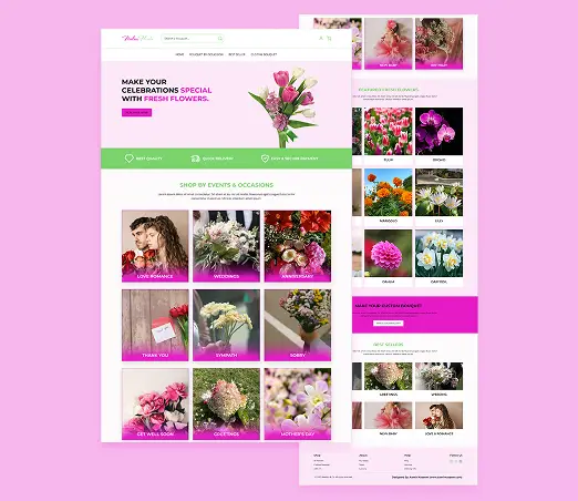
Neelum Flower is an online floral marketplace designed for users in Mansehra who want fresh, affordable flowers delivered to their doorstep. The website focuses on occasion-based arrangements (weddings, birthdays, anniversaries) and solves local challenges like unreliable flower quality and limited seasonal availability.
Project Duration
October, 2024 to November, 2024
Project Overview
The Problem
Users in Mansehra struggle to find fresh flowers for special events. Local shops often sell wilted bouquets, and many customers hesitate to trust online sellers due to bad past experiences.
The Goal
Design a trustworthy, easy-to-navigate website that highlights freshness, offers occasion-specific arrangements, and simplifies delivery customisation.
Project Overview
My Role
Lead UX Designer (research, wireframing, testing, and final design).
Responsibilities
Conducting interviews, paper and digital wireframing, low and high-fidelity prototyping,conducting usability studies, accounting for accessibility, iterating on designs and responsive design.
Understanding the User
User Research
Personas
Problem Statements
User Journey Maps
User Research: Summary
I conducted user interviews, which I then turn into empathy maps to better understand the target user and their needs. I discovered that many users wants to buy flowers online for different occeasions but they faces different issues like difficult and cluttered UI, uncredibility of online platforms, freshness of the flowers and delivery in time issues. So, they want to have a user-friendly website for shoping online flowers with quality and delivery in time assurance.
User Research: Pain Points
1
Freshness Concerns
AUsers worried about receiving wilted flowers.
2
Difficult Navigation
Difficulty finding arrangements for specific events (e.g., Mother’s Day).
3
Deliery Issues
No option to send flowers directly to recipients.
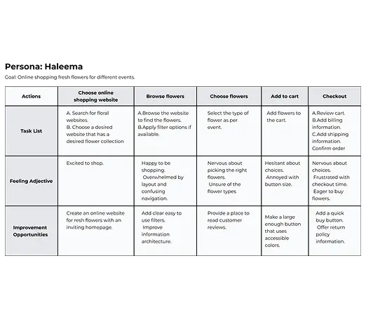
Persona: Haleema (Event Planner)
Problem Statement
Haleema is an event planner who need bulk wedding flowers, seasonal availability.
Haleem
Age: 29
Education: BA
Occupation: Event Planner
Goals
- Bigger Call to Action Buttons for Easy Navigation.
- Less cluttered navigation & layout for easier navigation.
- Easy checkout process.
Fraustrations
.-I struggle to find the fresh flowers for events online.
.-Online flower selling websites are hard to use.
- Websites what show don't sell freshness is concern.
Online shopping websites don’t provide an engaging browsing experience.
User Journey Map
I created a user journey map of Haleema’s experience using the site to help identify possible pain points and improvement opportunities.
Starting
the Design
Sitemap
Paper wireframes
Digital Wireframes
Useability Studies
Sitemap
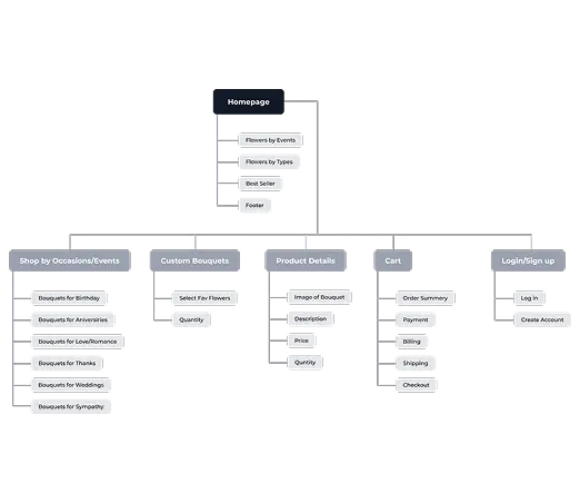
Difficulty with website navigation was a primary pain point for users, so I used that knowledge to create a sitemap.
My goal here was to make strategic information architecture decisions that would improve overall website navigation. The structure I chose was designed to make things simple and easy.
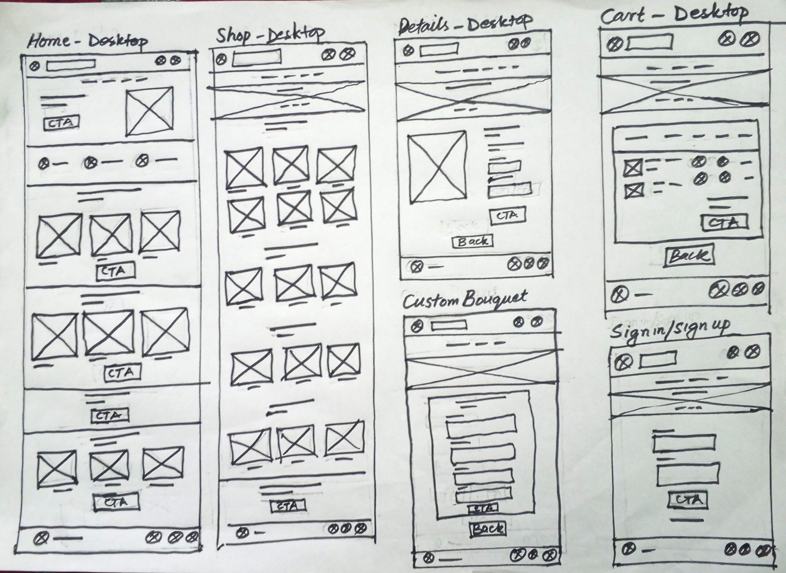
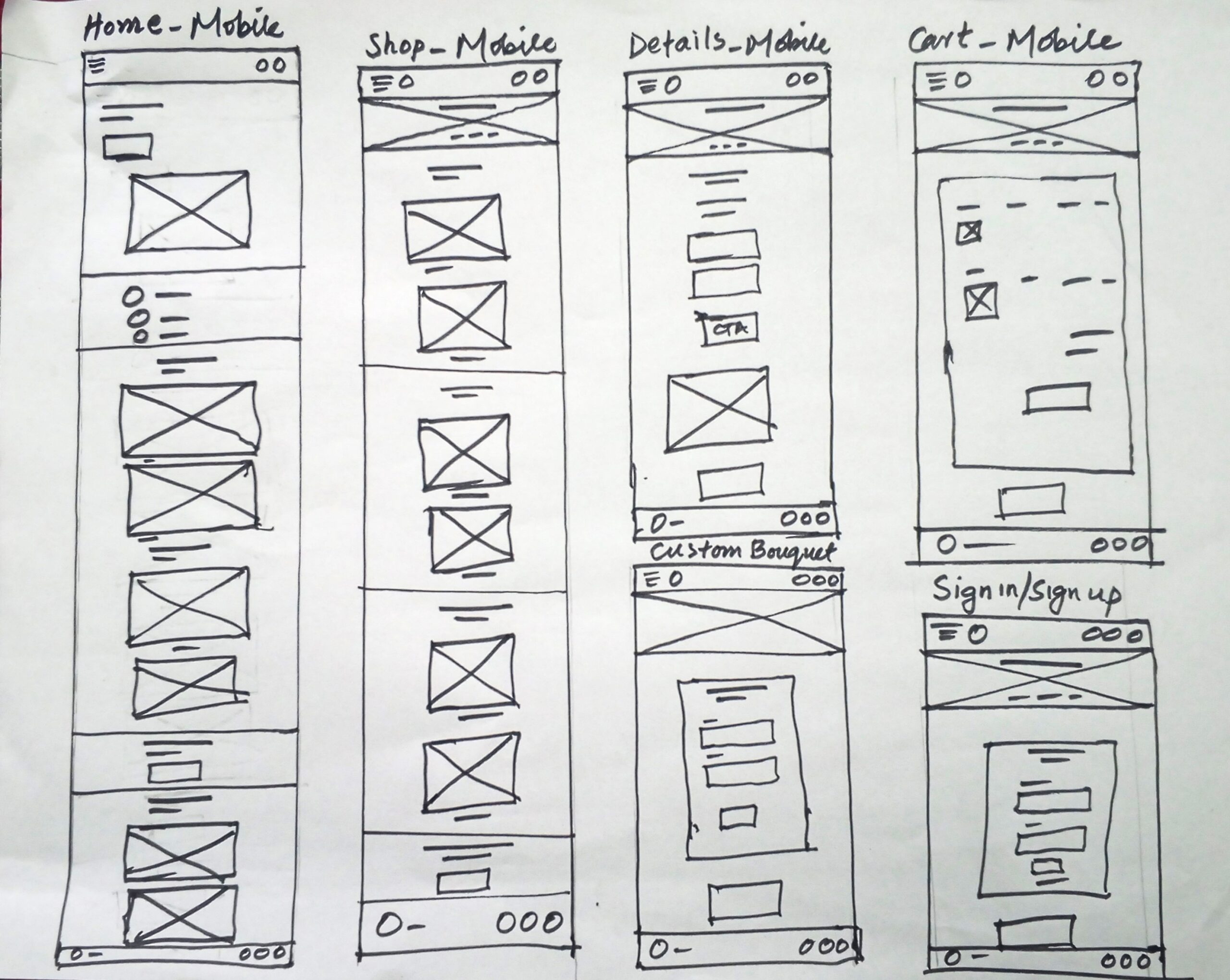
Paper Wireframes
Next, I sketched out paper wireframes for each screen in my app, keeping the user pain points about navigation, browsing, and checkout flow in mind.
Paper Wireframes
Screen Size Variation (Mobile)
Because Neelum Flower customers access the site on a variety of different devices, I started to work on designs for additional screen sizes to make sure the site would be fully responsive.
Digital Wireframes
Moving from paper to digital wireframes made it easy to understand how the redesign could help address user pain points and improve the user experience.
Prioritizing useful button locations and visual element placement on the home page was a key part of my strategy.
Digital Wireframe
Screen Size Variation(s)
Because Neelum Flower customers access the site on a variety of different devices, I started to work on designs for additional screen sizes to make sure the site would be fully responsive.
Usability Study: Parameters
Study type:
Unmoderated usability study
Location:
Mansehra, Remote
Participant:
05 participants
Length:
15-22 minutes
Usability Study: Findings
These were the main findings uncovered by the usability study:
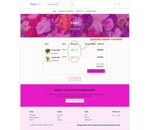
1
Cart
Once at the checkout screen, users didn’t have a way to edit the quantity of items in the cart.
2
Easy & Quick Registration
Users want an easy way to pay quickly during checkout.
3
Quick Registration
Users want to have a simple sign up process and little information to sign up.
Refining
the design
Mockups
High-fidelity prototype
Accessibility
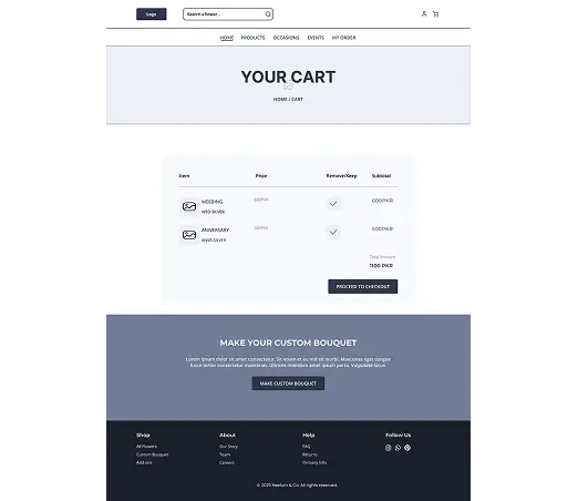
Mockups
Based on the insights from the usability study, I made changes to improve the site’s checkout flow. One of the changes I made was adding the option to edit the quantity of items in a user’s cart using a simple “+” or “-” option. This allowed users more freedom to edit their cart without going through a complicated process to add or remove items.
Before usability study
After usability study
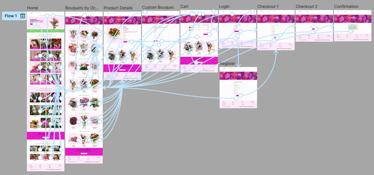
High-Fidelity Prototype
My hi-fi prototype followed the same user flow as the lo-fi prototype, and included the design changes made after the usability study, as well as several changes suggested by members of my team.
High contrast between text, icons, and background. Type icons are supplemented with text labels for clarity.
2
The combination of a clear sound and a text notification caters to different needs and ensures no user misses a reminder
3
All elements are properly labeled (e.g., “Personal task type button,” “Time picker, set to 3:00 PM”).
Going forward
Takeaways
Next steps
Takeaways
Impact:
User feedback on the final design was that it felt "quietly confident" and "deeply intuitive." Participants noted that the app successfully eliminated the anxiety of missing a reminder and the frustration of navigating a complex interface.
What I learned:
This project was a masterclass in restraint. I learned that true simplicity isn't about removing features, but about deeply understanding core user needs and designing a seamless, focused experience around them. The most fulfilling feedback was users saying, "It just works how I expected it to.".
Next steps
1
Conduct follow-up usability testing on the new app
2
Identify any additional areas of need and ideate on new features
Let's Connect
Thank you on reviewing my work on MATasks To-Do List Mobile App.
If you’d like to see more, or would like to get in touch, my contact information is provided below: