MATasks To-do List is a mobile app which is designed for the users of every type and age. To-do list app was designed for simplicity and convince. The apps available these days are difficult to use, full of unnecessary functions, need sign up and difficult to navigate. The idea to develop this was to easily keep track of daily activities. In this app user can easily add a task, edit it and delete it.
Project Duration
January, 2025 to February, 2025
Project Overview
The Problem
Available apps for task management have cluttered designs, need sign ups, unnecessary features and difficult navigation.
The Goal
To make a simple and easy to use mobile app which only have the functionality of entering a task, edit a task and delete a task.
Project Overview
My Role
Lead UX Designer (research, wireframing, testing, and final design).
Responsibilities
Conducting interviews, paper and digital wireframing, low and high-fidelity prototyping,conducting usability studies, accounting for accessibility, iterating on designs and responsive design.
Understanding the User
User Research
Personas
Problem Statements
User Journey Maps
User Research: Summary
I conducted user interviews, which I then turn into empathy maps to better understand the target user and their needs. I discovered that many users wants to keep track of their everyday tasks, but the available apps for doing this activity are very hard to use. These apps have cluttered user interface, a lot of unnecessary features, need sign ups and difficult navigation. So, this app is very simple and straight forward and user friendly.
User Research: Pain Points
1
Unnecessary Features
Available apps have many unnecessary features which make user overwhelmed and they can’t perform their desired action.
2
Unnecessary Sign Ups
Available apps require users to sign up and then they can manage their tasks.
3
Difficult Navigation & Cluttered Interfaces
The interface of the available apps is not user friendly, user can not enter a task easily.
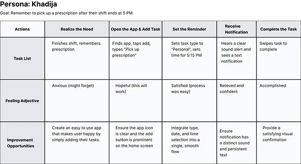
Persona: Khadija (Nurse)
Problem Statement
Khadija is a professional nurse and a busy house wife, she needs to make list of daily tasks and she wants that there should be an app which reminds her for her tasks with a text and sound notification.
Khadija
Age: 34
Education: BA
Occupation: Nure
Goals
- To capture a task with a reminder in under 15 seconds.
- To visually distinguish between work, personal, and family tasks at a glance.
- To have complete confidence that reminders will never be missed.
Fraustrations
.-Gets lost in menus trying to find the "add task" button.
.-Has missed reminders because notifications were easy to dismiss or didn't have a sound.
- Finds unused features like "productivity graphs" to be distracting rather than helpful.
“I just need to tell my phone ‘I need to do this thing later’ and trust that it will tell me when it’s time. I don’t need it to be complicated.”
User Journey Map
I created a user journey map of Khadija’s experience using the app to help identify possible pain points and improvement opportunities.
Starting
the Design
Sitemap
Paper wireframes
Digital Wireframes
Useability Studies
Sitemap
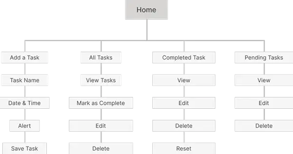
Difficulty with app navigation was a primary pain point for users, so I used that knowledge to create a sitemap.
My goal here was to make strategic information architecture decisions that would improve overall app navigation. The structure I chose was designed to make things simple and easy.
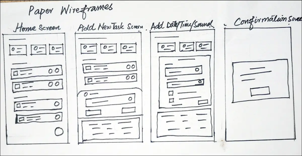
Paper Wireframes
Next, I sketched out paper wireframes for each screen in my app, keeping the user pain points about navigation, browsing, and checkout flow in mind.
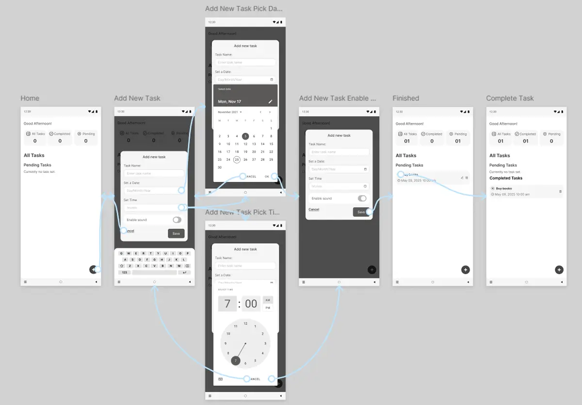
Digital Wireframes
Moving from paper to digital wireframes made it easy to understand how the redesign could help address user pain points and improve the user experience.
Prioritizing useful button locations and visual element placement on the home page was a key part of my strategy.
Low-Fidelity Prototype
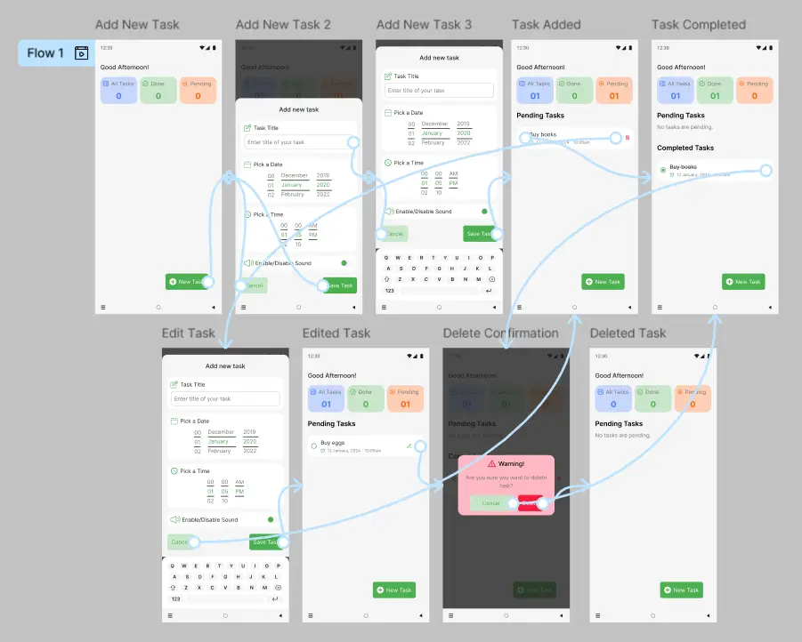
To create a low-fidelity prototype, I connected all of the screens involved in the primary user flow of adding an item to the cart and checking out.
At this point, I had received feedback on my designs from members of my team about things like placement of buttons and page organization. I made sure to listen to their feedback, and I implemented several suggestions in places that addressed user pain points.
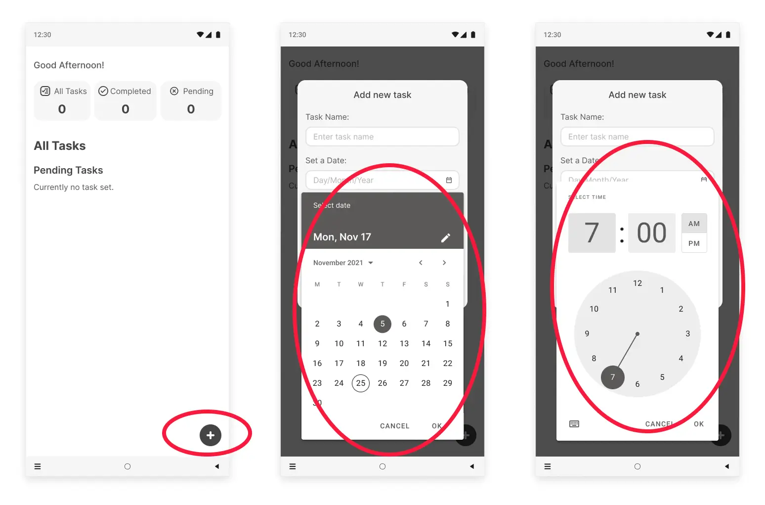
These were the main findings uncovered by the usability study:
1
Clear Call-to-Action
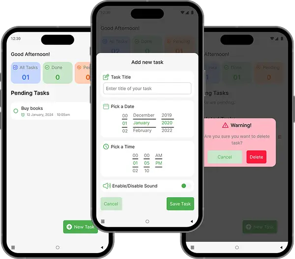
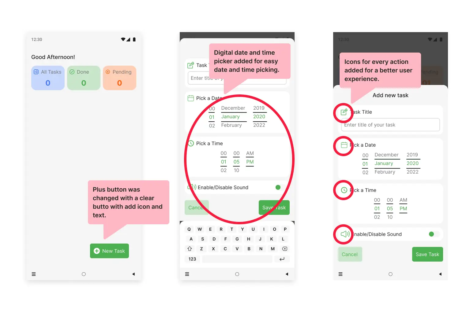
Based on usability study I found that users are a bit confused with plus button for adding new task, so I added a clear call-to-action button with icon and text.
2
Date/Time Picker
Based on usability study I found that the user felt difficulty in setting date and time so I added digital date and time picker which is easy.
3
Need of Icons
For better user experience icons for every action was mandatory so that users can quickly recognise what to do.
Refining
the design
Mockups
High-fidelity prototype
Accessibility
Mockups
After usability study the changes made in the digital wireframes by me.
Before usability study
After usability study
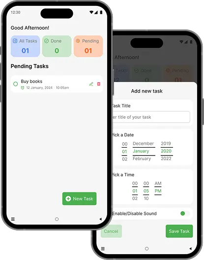
High-Fidelity Prototype
My hi-fi prototype followed the same user flow as the lo-fi prototype, and included the design changes made after the usability study, as well as several changes suggested by members of my team.
High contrast between text, icons, and background. Type icons are supplemented with text labels for clarity.
2
The combination of a clear sound and a text notification caters to different needs and ensures no user misses a reminder
3
All elements are properly labeled (e.g., “Personal task type button,” “Time picker, set to 3:00 PM”).
Going forward
Takeaways
Next steps
Takeaways
Impact:
User feedback on the final design was that it felt "quietly confident" and "deeply intuitive." Participants noted that the app successfully eliminated the anxiety of missing a reminder and the frustration of navigating a complex interface.
What I learned:
This project was a masterclass in restraint. I learned that true simplicity isn't about removing features, but about deeply understanding core user needs and designing a seamless, focused experience around them. The most fulfilling feedback was users saying, "It just works how I expected it to.".
Next steps
1
Conduct follow-up usability testing on the new app
2
Identify any additional areas of need and ideate on new features
Let's Connect
Thank you on reviewing my work on MATasks To-Do List Mobile App.
If you’d like to see more, or would like to get in touch, my contact information is provided below: