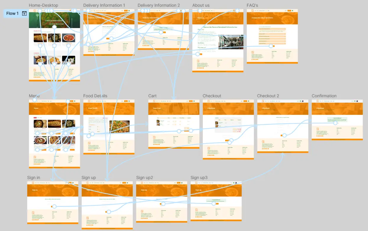
Pindi Platters Website Design

Aamir Naseem

laptop website mockup

Project Overview

The product

PindiPlatters is a restaurant located in the mid of Rawalpindi which also sell online traditional food of Rawalpindi in the surroundings of Rawalpindi city. This website is designed for those who either are the local youth of Rawalpindi or the outsider who work or study here and they want to taste the famous and traditional food of this city.

Project duration

November 2024 to December 2024

Project Preview

Project Overview

The Problem

Young students and professionals in Rawalpindi, often living away from home, struggle to find affordable, authentic, and convenient traditional food. Their busy schedules and limited budgets make cooking difficult, and they desire the comfort of home-cooked-style meals delivered reliably to their doorstep.

The Goal

To design and launch a user-friendly online food ordering website that provides a seamless, reliable, and satisfying experience for time-poor, budget-conscious individuals to order authentic Rawalpindi cuisine, thereby becoming their go-to solution for traditional food delivery.

Project Overview

My Role

Lead UX Designer (research, wireframing, testing, and final design).

Responsibilities

Interviewing users and creating personas. Designing responsive layouts for desktop and mobile. Testing prototypes and refining accessibility.

Understanding the User

User Research: Summery

I conducted user interviews, which I then turned into empathy maps to better understand the target user and their needs. I discovered that many target users treat online shopping as a fun and relaxing activity when they need a break from school or work. However, many shopping websites are overwhelming and confusing to navigate, which frustrated many target users. This caused a normally enjoyable experience to become challenging for them, defeating the purpose of relaxation.

User Research: Pain Points

1

Difficulty Discovering Traditional Food

Struggling to find truly traditional food that reminds them of home in a convenient delivery format.

2

Uncertain Delivery Availability

Users don’t know if the restaurant delivers to their specific hostel or apartment area.

3

Inconvenient Payment Options

Lack of easy and quick payment methods like mobile payments or debit card payment on websites.

Persona: Fatima (Busy Professional)

Problem Statement

Fatima is a software engineer works in Rawaalpindi from Lahore who lives in a rental apartment in Rawalpindi. She has a busy job schedule so she often orders online food.

Haleema

Age: 28

Education: BS
Occupation: Software Engineer

Goals

- To order food multiple times in a week..
-Need customization options.
- Less cluttered navigation & layout for easier navigation.
- Easy checkout process.

Fraustrations

- Unreliable delivery times.
-Limited payment options.
- Food does not match homemade quality.
-Complex user-interface.

Works long hours and values convenience. Doesn’t have time or energy to cook after work. Seeks hearty, authentic meals delivered quickly.

Persona: Muhammad Hussain (Student)

Problem Statement

Muhammad Hussain is Computer Science Student from Queta who lives in a hostel in Rawalpindi. He has a busy study schedule so he often orders online food.

Muhammad Hussain

Age: 28

Education: BS
Occupation: Software Engineer

Goals

- To find the most affordable and traditional meal.
-Split order with friends.
- Pay easily via mobile wallet.
- Easy checkout process.

Fraustrations

- Hidden delivery charges.
-Limited payment options.
- Food does not match homemade quality.
-Complicated ordering processes .

Has a tight budget and no cooking facilities. Craves traditional food but can’t afford expensive restaurants. Very tech-savvy.

User Journey Map

I created a user journey map of Fatima’s and Muhammad Hussains’s experience using the site to help identify possible pain points and improvement opportunities.

Starting the Design

Sitemap

Difficulty with website navigation was a primary pain point for users, so I used that knowledge to create a sitemap.

My goal here was to make strategic information architecture decisions that would improve overall website navigation. The structure I chose was designed to make things simple and easy.

Paper Wireframes

Next, I sketched out paper wireframes for each screen in my app, keeping the user pain points about navigation, browsing, and checkout flow in mind.

The home screen paper wireframe variations to the right focus on optimizing the browsing experience for users.

Paper Wireframe Screen Size Variations

Because Neelum Flower customers access the site on a variety of different devices, I started to work on designs for additional screen sizes to make sure the site would be fully responsive.

Digital Wireframes

Moving from paper to digital wireframes made it easy to understand how the redesign could help address user pain points and improve the user experience.

Prioritizing useful button locations and visual element placement on the home page was a key part of my strategy.

Digital Wireframe Screen Size Variation(s)

Home Mobile

Usability Study: Parameters

Study type:

Unmoderated usability study

Location:

User your location

Participant:

05 participants

Length:

15-22 minutes

Usability Study: Findings

These were the main findings uncovered by the usability study:

1

Customization Option

In the food details page there was no customization option so that user can change the quantity and type of food.

2

Checkout

Users want an easy way to pay quickly during checkout, so mobile payment system was added.

3

Quick Registration

Users want to have a simple sign up process and little information to sign up.

Refining the design

Mockups

Based on the insights from the usability study, I made changes to improve the site’s checkout flow. One of the changes I made was adding the customization option in food details page so that user can change the quantity and food from this place.

Before usability study

Details Page

After usability study

Food Details Page

Mockups: Original Screen Size

Mockups: Screen Size Variations

I included considerations for additional screen sizes in my mockups based on my earlier wireframes. Because users shop from a variety of devices, I felt it was important to optimize the browsing experience for a range of device sizes, such as mobile and tablet so users have the smoothest experience possible.

Accessibility Considerations

1

I used headings with different sized text for clear visual hierarchy

2

I used landmarks to help users navigate the site, including users who rely on assistive technologies

3

I designed the site with alt text available on each page for smooth screen reader access

Going forward

Takeaways

Impact:

Our target users shared that the design was intuitive to navigate through, more engaging with the images, and demonstrated a clear visual hierarchy.

What I learned:

Our target users shared that the design was intuitive to navigate through, more engaging with the images, and demonstrated a clear visual hierarchy.

Next steps

1

Conduct follow-up usability testing on the new website

2

Identify any additional areas of need and ideate on new features

Let's Connect

Don’t hesitate to talk about your design problem. Contact me to solve your design problem with me and find a better solution.